Description
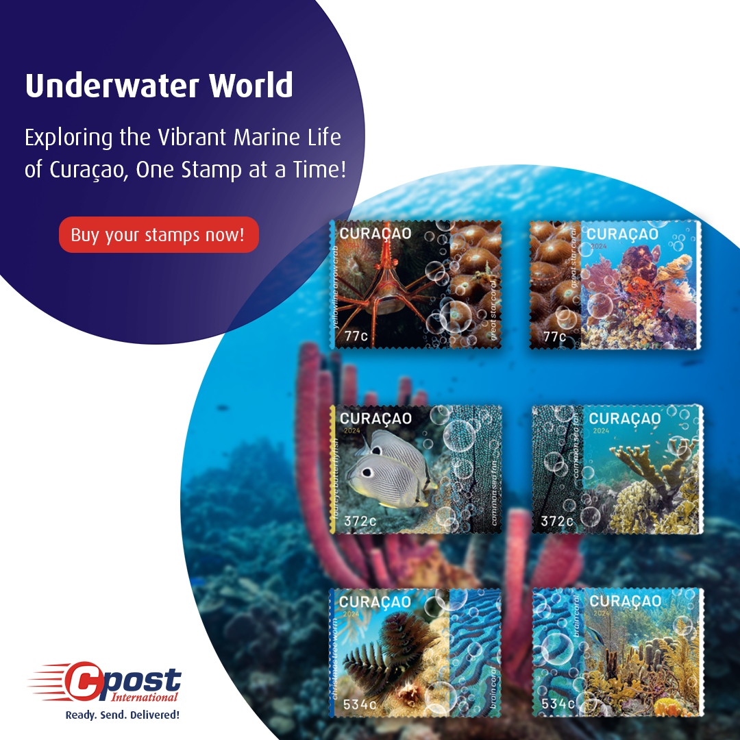
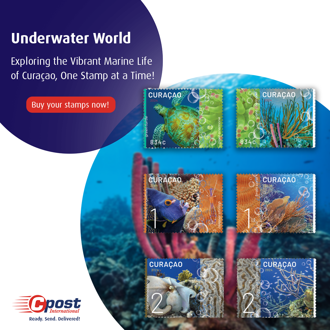
The design consists of six sets of two interconnecting stamps showcasing Curaçao’s underwater world. For each set, a reef species is depicted on the left stamp,
combined with an overview photo of the coral on the right stamp. The two images are separated by a close-up photo with a patterned effect, creating a continuous
flow between the two stamps in each set.
The overview photos represent the vast diversity and richness of Curaçao’s marine life. The reef species featured on the left stamp are varied (fish, mollusks,
shellfish, etc.) and all native to the island. The species in the close-ups are also found in Curaçao. The underwater world of Curaçao not only has great diversity but is
also very colorful. Therefore, images rich in color and light were chosen. The three images in each set are color-coordinated and further connected by a transparent
layer of white and blue bubbles. These bubbles symbolize diving or snorkeling, which are popular among tourists and the main ways to explore Curaçao’s stunning
coral reefs.
Each stamp features the country’s name, the denomination or value of the stamp, the name of the species on the close-up photo, and the year. The left stamp also
includes the name of the reef species depicted. The species names are italicized, and “Curaçao” is written in small capital letters. A neutral sans-serif font was chosen
to ensure the text remains secondary to the visuals. The texts are in lowercase, promoting unity and calmness. Apart from the year, all text is rendered in
high-contrast white.
The vertical lines on the left and right of each stamp set, combined with vertically placed text and the ascending or rising bubbles, create a recurring vertical rhythm
on the stamps. Since the right stamp does not include the name of the coral reef, a white border on the far right acts as a counterbalance to the white text further
left. On the left stamp, a colored bar provides contrast to the white species name. This creates an intriguing contrast between the left and right stamps of the set,
while maintaining consistency across the six sets.
